Char Launcher
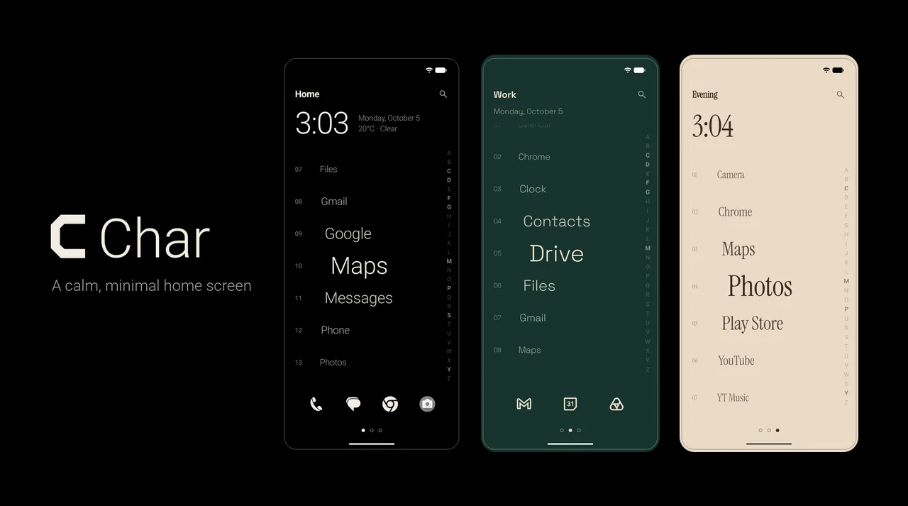
Our own Android home screen: your apps in one calm, numbered list instead of a grid of icons — customisable page by page, and built to feel instant under your thumb.
The brief
A phone’s home screen is designed to be looked at. Grids of bright icons, badges and folders all compete for attention, and the result is a device that pulls you in every time you unlock it to do one thing. Minimal launchers exist, but most strip the screen back to plain text and stop there — calm, but flat, and hard to live with once you want it to look like yours.
Char is our own product, and the brief came down to three words that pull against each other: calm, customisable and fast. Calm means nothing on the screen asks for attention it hasn’t earned. Customisable means people can make it theirs — colours, type, layout, what shows up when — without the result sliding back into clutter. And fast means it has to feel instant every single time, because the home screen is the screen you see more than any other, and any stutter on it reads as the whole phone being slow.
The details
The list is the whole idea, so it got the most care. Every row’s size, opacity and indent comes from one smooth curve of its distance from the centre of the screen, so as you scroll, each app grows into focus and falls away again without ever jumping between states — and a fling always settles with one app exactly in the middle. The edges of the list fade rather than clip, but only as far as there is more to see beyond them, so the first and last apps stay crisp when the list comes to rest against an end. Zoom comes in three strengths, from a gentle taper to a dramatic one, because how much motion feels calm is personal.
It also had to be fast on any Android phone, not just a flagship. A launcher that drops frames feels broken in a way no other app does, so scrolling was built to do as little work as possible: every row is laid out once at full size, and the scaling, fading and indenting happen only while drawing, so the list never has to be re-measured mid-scroll. App icons are rendered off the main thread and cached, and Char draws everything itself on Compose’s foundation layer — we dropped Material components entirely — so there is no framework styling to fight and nothing on screen we didn’t choose.
The transitions are there to keep you oriented, not to show off. Swiping between pages blends one page’s colours into the next frame by frame, with the status and navigation bars following along. Scrubbing the A–Z index ticks once per letter and glides the list on a soft spring; each new letter picks up from wherever the list already is instead of starting over, so dragging down the alphabet feels like one continuous motion. And customisation has guardrails, so freedom never costs legibility: the colour shuffle keeps drawing until the text clears a 4.5:1 contrast ratio, and settings always use Char’s own black and cream, so no palette can make them hard to read.
The outcome
Char launched on Google Play in October 2026, within a week of the first commit — free, with Char Pro as a one-time upgrade. It runs on Android 8.0 and up, on phones and tablets, with a two-column layout in landscape, and is backed by 66 automated tests.